Marine Corps Marathon.
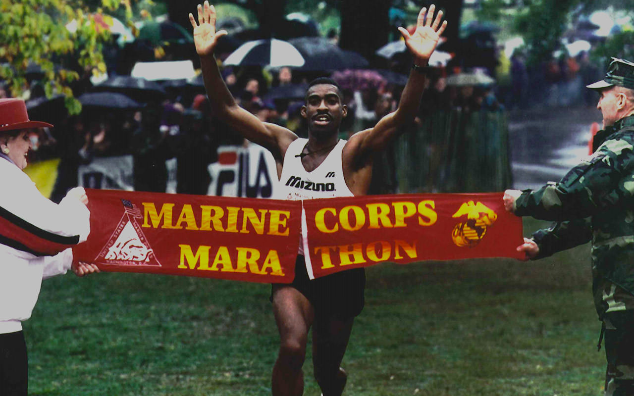
Since its founding in 1976, the mission of the Marine Corps Marathon has been to promote physical fitness, generate community goodwill, and showcase the organizational skill of the United States Marine Corps. Holding the capacity for over thirty thousand runners from all fifty states and more than fifty countries, the annual race known as “The People’s Marathon” is the fourth largest marathon in the United States and the ninth largest in the world.
Realizing their current digital experience left users in the dust, the Marine Corps Marathon team approached nclud with the hefty task of a ground up restructure, redesign, and rebuild. This set in motion the year long challenges of elevating awareness of events, embracing the general public for registration, establishing language to help foster emotional resonance, and emphasizing the Marine Corps brand. With the risk of 200,000 users getting lost along the way, we knew the stakes couldn't be higher.
Strategy
Research and validation guided every step of our process.
The Marine Corps Marathon had traditionally been a single event organization, with their naming and branding reflecting that — however, they now had six additional events that were growing quickly and needed better representation and branding on the site. Each event had its own results, images, registration, updates, and details that continually competed with other site content and calls to action. We needed to come up with a solution that allowed users to find the specific event information that they wanted without confusing it with similar information from other events. To start, we compiled all of the existing site content and analyzed what content types fell within each event and where there were overlaps. The messy and disorganized information was confusing to visitors, so we took a step back and visualized the content groupings into an understandable and comprehensive structure that we lovingly nicknamed “The Millennium Falcon.”


With this structure in place, we categorized all of the site content and grouped it by each event as well as content type. This approach allowed the visitor to navigate to the Historic Half Marathon page and find relevant event registration and results, but also navigate directly to general results and registration pages before selecting the Historic Half Marathon. Visitors would have two (or more) paths to the content they wanted without heavily siloing the site. After categorization and mapping visitor flows, we conducted A/B tree tests to see if users could navigate this new structure to determine that it could perform better than the current structure. The results validated our thinking and with a few informed tweaks we had a structure that was intuitive and tested well with target users.
User Experience
We needed to understand the runners and their goals to create the best user experience.
Utilizing the marathon’s extensive runner database, we interviewed marathon runners of all skill and experience levels from across the country. Signing up and running a marathon is a complicated and often stressful task with many steps, spanning almost a full year. We needed to understand how marathon runners plan, train, and run the event so that we could create an experience on the site that presented the right information at the right time and was adaptable and easy to use for both race registration and for race day content. Over twenty interviews were conducted, resulting in targeted persona maps of characters likely to visit the site. Mapping out these identities was vital to understanding how users would interact with the content. (One of our favorite personas was “Reginald,” a sixty-year-old runner who had completed fifty marathons in his lifetime, answered calls on his flip phone, and was looking to qualify for the Boston Marathon.)
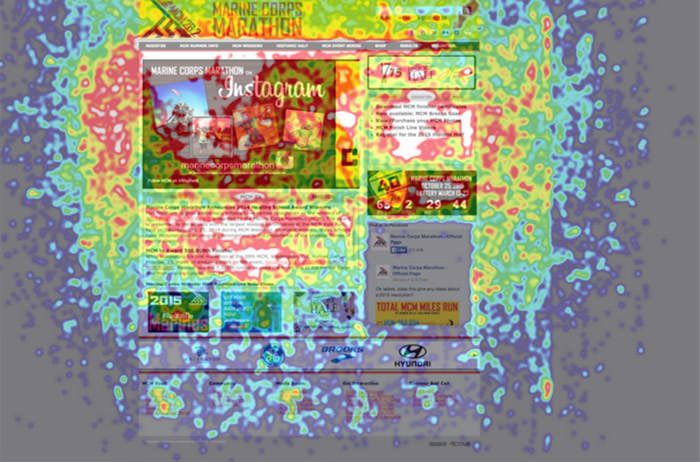
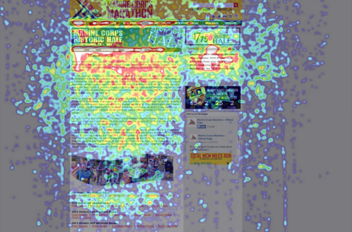
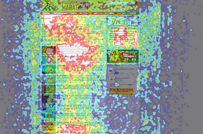
Alongside the interviews, we expanded our research to not only reach existing runners, but also prior and potentially future runners. We sent a survey to all marathon participants from the past year, asking them about their experience with the site before, during, and after the race. Monitoring and analyzing usage of the current site using heat maps, eye tracking, and user analytics, we were able to identify key pain points that visitors experienced when trying to navigate, get more information, and register for events.
| Key Performance Indicators With user research, persona mapping, and visitor testing complete, we distilled the results of our efforts into our Key Performance Indicators that would guide the user experience, design, and development teams to success. | |
|---|---|
| Key Performance Indicator 1 Increase visibility of event series programming. Marine Corps Marathon is well known for its namesake event but they also put on seven other shorter distance races throughout the year. We needed to increase the prominence of these events on the site without downplaying the signature marathon. | Key Performance Indicator 2 Quantify sponsorship opportunities through analytics and explicit placement schemes. The current site made it impossible to track impressions on sponsored ads and only had a few limited implementations and placement areas for ads, leading to problems sharing information with existing sponsors as well as gaining new sponsors for the various events. |
| Key Performance Indicator 3 Increase registration rate for women runners. Past race metrics combined with user research and testing showed that often women felt left out of the marketing and community. We needed to make the race feel more open and friendly to women and non-military personnel. | Key Performance Indicator 4 Bring the site to mobile users with a responsive and highly optimized design. The existing site was focused on desktop users and slow to load — both deal breakers with mobile users, especially with the existing stress of registration and planning. Using a “mobile first” process would allow us to focus on those users and their needs before expanding across all devices. |
After determining our Key Performance Indicators, we began the process of reorganizing more than two hundred pages of content and information. The current site was loaded with legacy content and old media without any linking or connection, making it extremely difficult for the user to access relevant information. By breaking the main content areas into their own landing pages, we created a hub for each event that allowed visitors to find content for each race in a predictable and simple manner. The new structure also allowed visitors to easily navigate between the events and access the results or registration information for a specific event without needing to go all the way back to the homepage.


Instead of wireframing all of the pages on the site in a traditional way, we instead chose to approach the entire site from a more modular point of view, creating a series of content blocks and segments that could be reused across the site as well as added and removed during specific event timelines. This allowed us to account for all types of content that may exist (not just what already existed) as well as to focus on the mobile information hierarchy. Only once the modules and content structures were in place did we move into more standard wireframes, using our blocks to lay out key pages and layouts. With the site now pushing visitors towards eight different events instead of having them exist as afterthoughts to the main marathon, the modular structure and lightweight wireframes helped visualize and organize the similar structures between them but also highlight the small differences in content and information.
Design
Before we designed, we worked with the Marine Corps Marathon team on a series of brand workshops.
To design an experience that reflected all aspects of the marathon and its history, it was important to discover the emotions associated with the event, the themes that resonated with the runners and the marathon team, as well as the pitfalls and challenges they had previously encountered. We needed to create an entire design system and organizational style that appealed to the general public while hinting at its military roots, shared the emotional narrative of the race and the runners involved, and emphasised motion and texture. These workshops and discussions led to three distinct visual styles inspired by the Marine Corps dress blues uniform, war and service memorial typography, as well as contemporary athletic design.
Alongside the Marine Corps Marathon team, we worked through the initial style concepts into a style that encompassed all of the feelings and themes that were important moving forward. Our first concept was lighter, with a more open interface contrasted by bold color and imagery. The second was flatter, with a more kinetic feeling and integrating data visualization elements to represent maps, images, and infographics. The third focused on the contrast between the traditions of the race and bold modern athletic imagery while still emphasizing specific Marine Corps traits of preparedness and history. Inspired by the idea of movement, typography with command presence, and a dark but approachable interface, the final styles injected feelings of motion and action through the use of textures (asphalt, dirt, sweat) and military symbols (badge shapes, chevrons). We used photographic styles using civilians next to Marines to amplify the human elements and feel relatable to all runners. Our goal was to create an environment on the site that would make visitors feel like they were already running the race.

One of the biggest challenges when entering the design phase of the project was to create a site that was approachable and appealing to all audiences, not just Marines or those with a military background. The masculinity of the current brand and its reputation was a hurdle between us and the finish line. We solved this by incorporating more engaging imagery of Marines interacting with fellow runners in diverse groups. Balancing light and dark within the color palette helped us create a more open and engaging interface for all while still retaining the Marine Corps Marathon look and feel.
Another underlying goal of the team was to ensure we infused the new design with subtle references to the marathon’s history. Using the historic “gold” color in contrast to the strong, bold scarlet calls back to the official colors of the United States Marine Corps, while the call to action and badge shapes are based on uniform epaulettes and official military service patches. Chevron arrows, based on the ranks of the Marines, were incorporated into the design to drive visitors to specific content as well as to convey movement and the energy of running a marathon. Such design cues helped create a feeling that was tied directly to the marathon’s origins and military traditions without feeling overwhelming or nationalistic.
Development
We balanced high traffic spikes and server loads while building fully customizable content modules.
From day one, our engineering team audited the existing technical infrastructure of the current website. Coupled with our strategy and user experience analyses and interviews with internal technical staff and content editors, we worked with the Marine Corps Marathon to navigate through a Content Management System (CMS) selection process. With the modular structure in place, it was decided to use Craft CMS due to its highly configurable structure. This allowed development and engineering to very quickly update and revise pieces of the site and content without focusing all of their energy on overarching pages or structures.
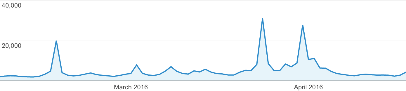
On the server side, the website historically experienced huge traffic spikes at various times in the race lifecycle — ticket sales announcement, ticket sale launch, and on race day. With active visitors on the site reaching over 800% the normal traffic at these times, we needed to build a scalable solution that would easily ramp up and remain stable during key traffic times. Starting with a robust, load-balanced Amazon Web Services hosting environment, we also employed multi-tiered application level caching to ensure visitors only loaded what they needed without crashing the system. When the site launched in time for the annual marathon, it not only experienced zero downtime but also served up pages in less than half of the average load time of previous years due to these server and hosting improvements.
Results
Our collaboration helped lead the Marine Corps Marathon team to victory.
With the site launching ahead of the official marathon announcement and registration, it was an immediate success. The work done to improve the user flows and to minimize server load ensured a smooth experience for all visitors, directly leading to a 35% registration growth from the year before, well above the predicted registration numbers. Our goal of creating a more gender-neutral experience led to an increase of 15% in women runners registering for the marathon. It wasn’t just the primary race that was affected, either — the Historic Half traffic grew by 31% and 17.75K traffic grew by 77% when they announced their respective registrations. Additionally, the new navigation structure and redesigned user journey led to an 150% improvement over 2015 in visits to the correct race registration page.
Finally, on race day itself, The Marine Corps Marathon website logged more than 170,000 visits and the app was used in more than 900,000 sessions. The Marine Corps Marathon Facebook page reached 1.8 million users and became a top trending topic (just behind Kylie Jenner). Nearly 25,000 total participants between the Marine Corps Marathon and the MCM10K were on course for the race. The day prior, almost 3,300 children dashed through the Marine Corps Marathon Kids Run.
Race site visits and registrations weren’t the only aspects affected by the redesign and rebuild. Our responsive design and server load-balancing led to an 8% growth in visitors from mobile devices over the same time last year, while at the same time the bounce rate from visitors leaving the site immediately dropped 12% and pages per session increased over 50%, meaning visitors were more likely to read more about the marathon and its history (and maybe want to run it themselves, even if they hadn’t thought about it before). The specific focus on the design and implementation of the sponsors and advertisers also led to overwhelming improvements: visits to sponsor pages grew by over 610%, encouraging more sponsors and advertisers to get involved.
Our staff is in a better place having a more user-friendly content management system. The runners are in a better place with a cleaner, more vibrant online experience. The Marine Corps is in a better place as its largest public relations event, the Marine Corps Marathon, now boasts a thoughtful and impressive online presence.
Marc Goldman Sponsorship/Marketing Manager Marine Corps Marathon
Working alongside the Marine Corps Marathon team every step of the way, we were excited to start from the ground up to challenge and rethink the way the site worked and how visitors interacted with it. By taking the existing structure and rebuilding it from the ground up, we were able to create a user flow for visitors that led them directly to the information they needed, as well as exposed them to new information, history, and races along the way. Our collaboration led to a more dynamic and interactive user experience, not just for runners, but for anyone interested in “The People’s Marathon” and the comradery between the Marines, Sailors, and civilian communities that work hard to make it one of the best race events in the world.
Visit Marine Corps Marathon.
About Marine Corps Marathon
The Marine Corps Marathon is one of the largest marathons in the United States and stands as the largest marathon in the world that doesn't offer prize money, earning its nickname “The People's Marathon.” Over the years, the Marine Corps Marathon has evolved into a premier running organization with thirty full-time staff members in Quantico, Virginia and thousands of Marines, Sailors, and civilian volunteers from across the country working to ensure the mission is carried out as its founders intended.