Bank for Good.

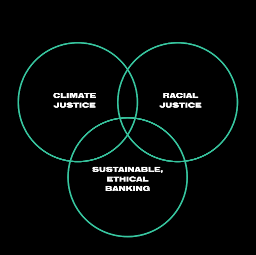
Ideas42 hired nclud as a group of partners to design and build an interactive website, brand and campaign to help consumers find pro-climate institutions and make the switch to what we’ve coined as a Bank for Good. The overarching issue at stake is lives at the intersection of racial, climate, and economic justice. Bank for Good believes that access to sustainable, ethical banking is a racial justice issue.
Strategy
Indentifying and speaking to diverse audiences.
The Bank for Good campaign focuses on building a movement by creating a groundswell of racially and environmentally conscious individuals who divest from misaligned banks and switch to values-aligned banks, for a better future for BIPOC lives and for our environment.
This campaign presents the opportunity to draw connections between racial, climate, and economic justice. It will test messages and experiment with alternative methods: utilizing banks themselves as messengers, building coalitions across issue spaces, and testing consumer-first messaging alongside environmental messaging.
Our guiding theory of change for this initiative is that if we can call on racially conscious, environmentally aware, value-aligned individuals to switch from a dirty bank to a clean bank, we can send a message to dirty banks that investing in fossil fuels is not acceptable to their consumer base.
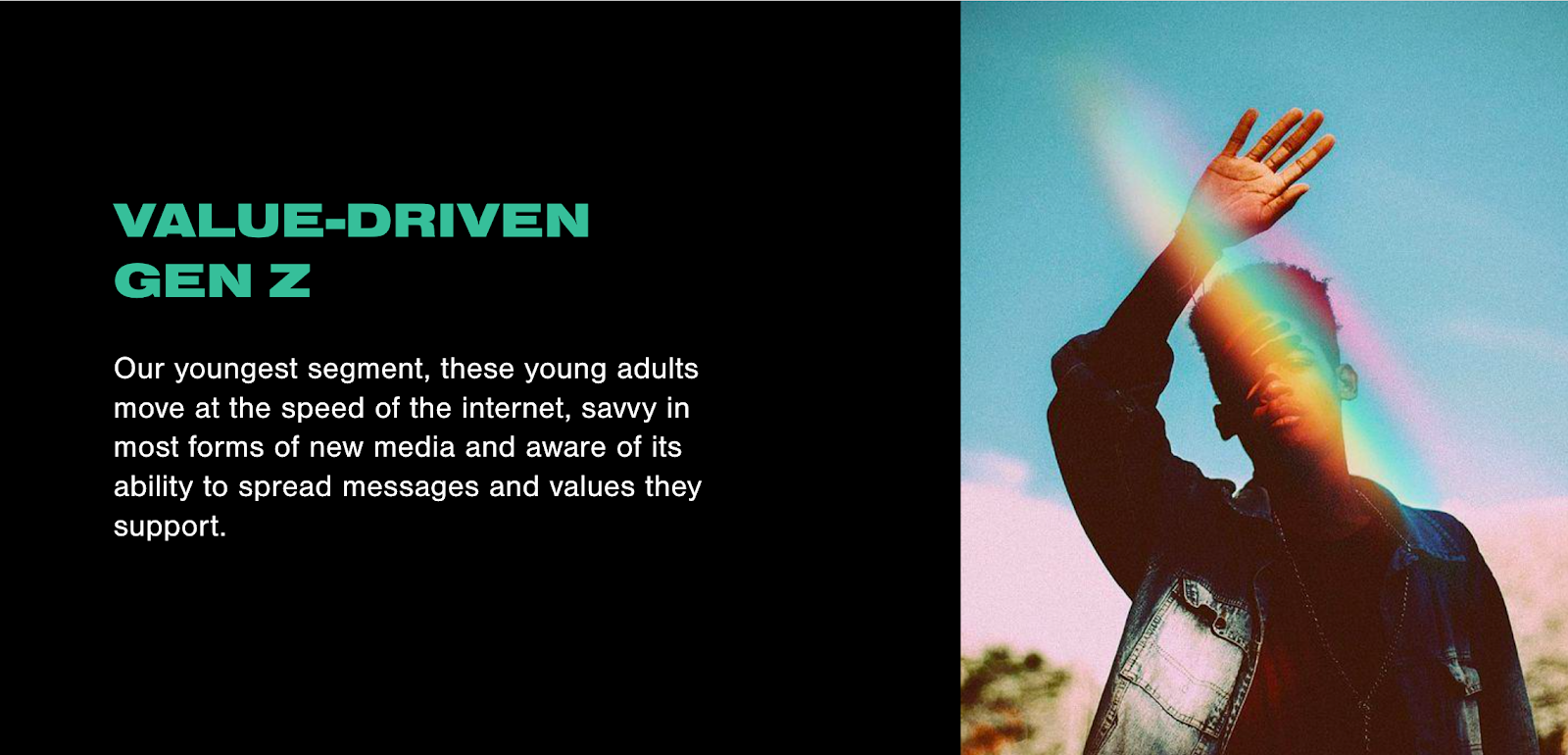
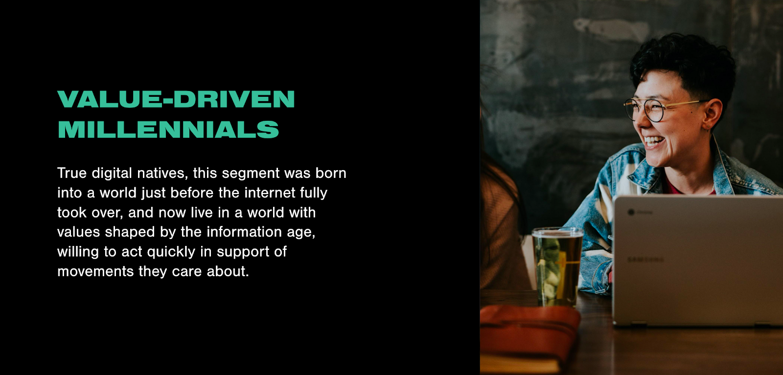
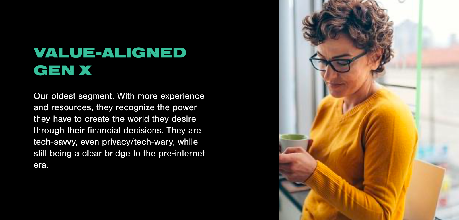
As a result of focus groups, interviews, and online qualitative boards, we narrowed our target demographics down to three key audience groups.
User Experience
We needed to understand the runners and their goals to create the best user experience.
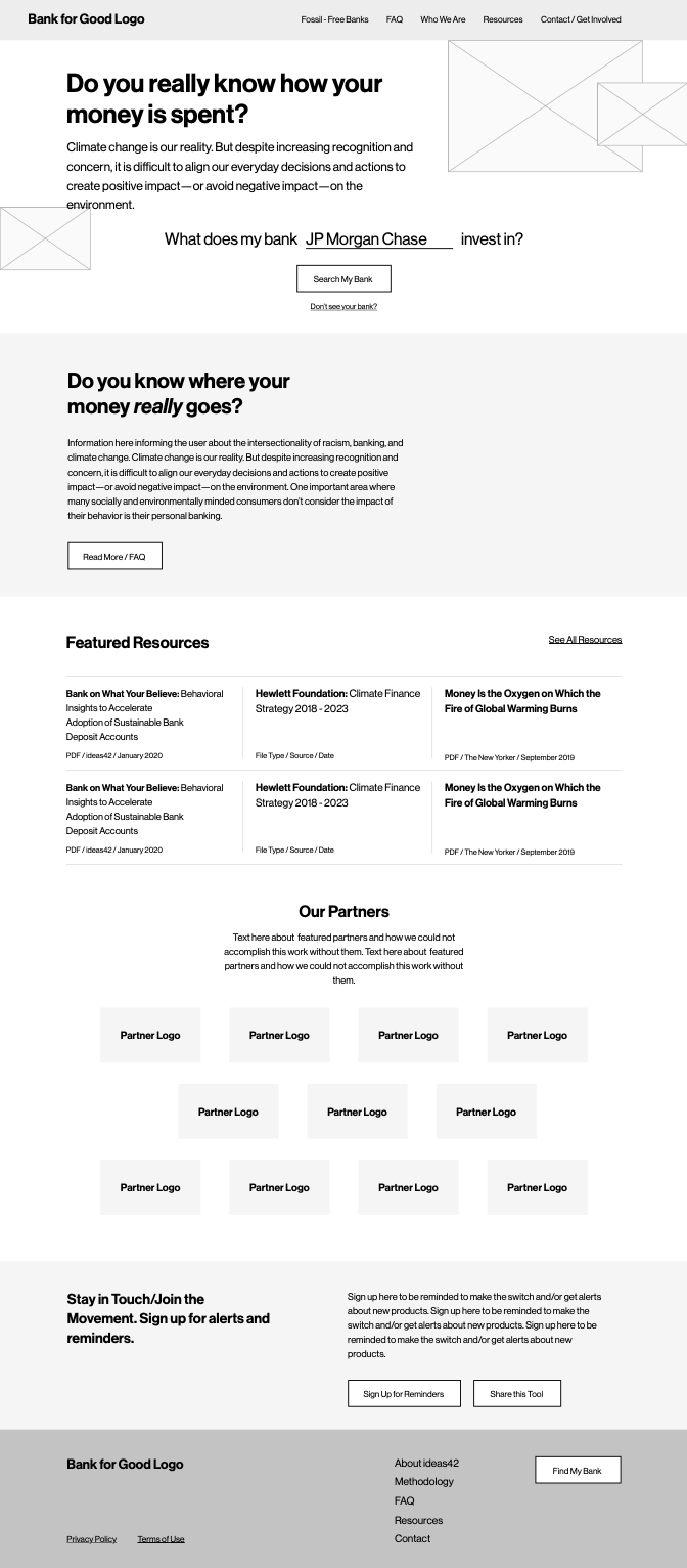
Another key element of this project was wireframing the user flow. Initially, we thought the experience would go as follows: we’d start with a search that would indicate whether or not they were investing in a “Bad Bank” - or banks on RAN’s list of the worst fossil fuel funders. Then, the user is prompted to find a good bank based on their location and preference for an online account or now.
After our first round of wireframes were created, 10 usability tests were conducted with users to determine:
- Whether or not users understand the overall purpose of the tool.
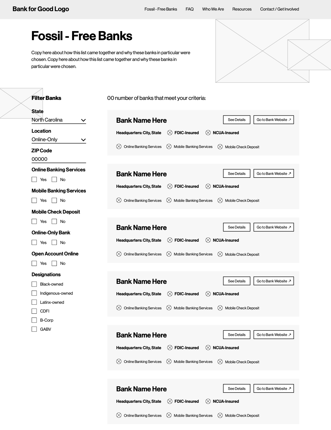
- How well or not users can use the various tools (bad bank search, simple “mad libs” search, advanced filters, etc).
- How much or how little users engaged with the content on the site (e.g. did they understand the terminology used? Were they interested in the additional readings and campaigns?).
Usability testing resulted in several key takeaways, all of which we incorporated into the final round of wireframing:
- Users were confused as to whether or not Bank for Good was a bank itself.
- We needed to get rid of the Bad Bank search entirely and instead focus on helping the user find a Good Bank. Our goal should not be to shame users’ previous choices and Bad Banks, but instead to encourage the switch.
- The primary and only call to action on the site should be to "Find a Good Bank."
- In general, users felt that there were too many calls to action and confusing forms.
- At times, banking industry terminology was confusing for users. Definitions should be provided throughout the experience to include additional context.
Design
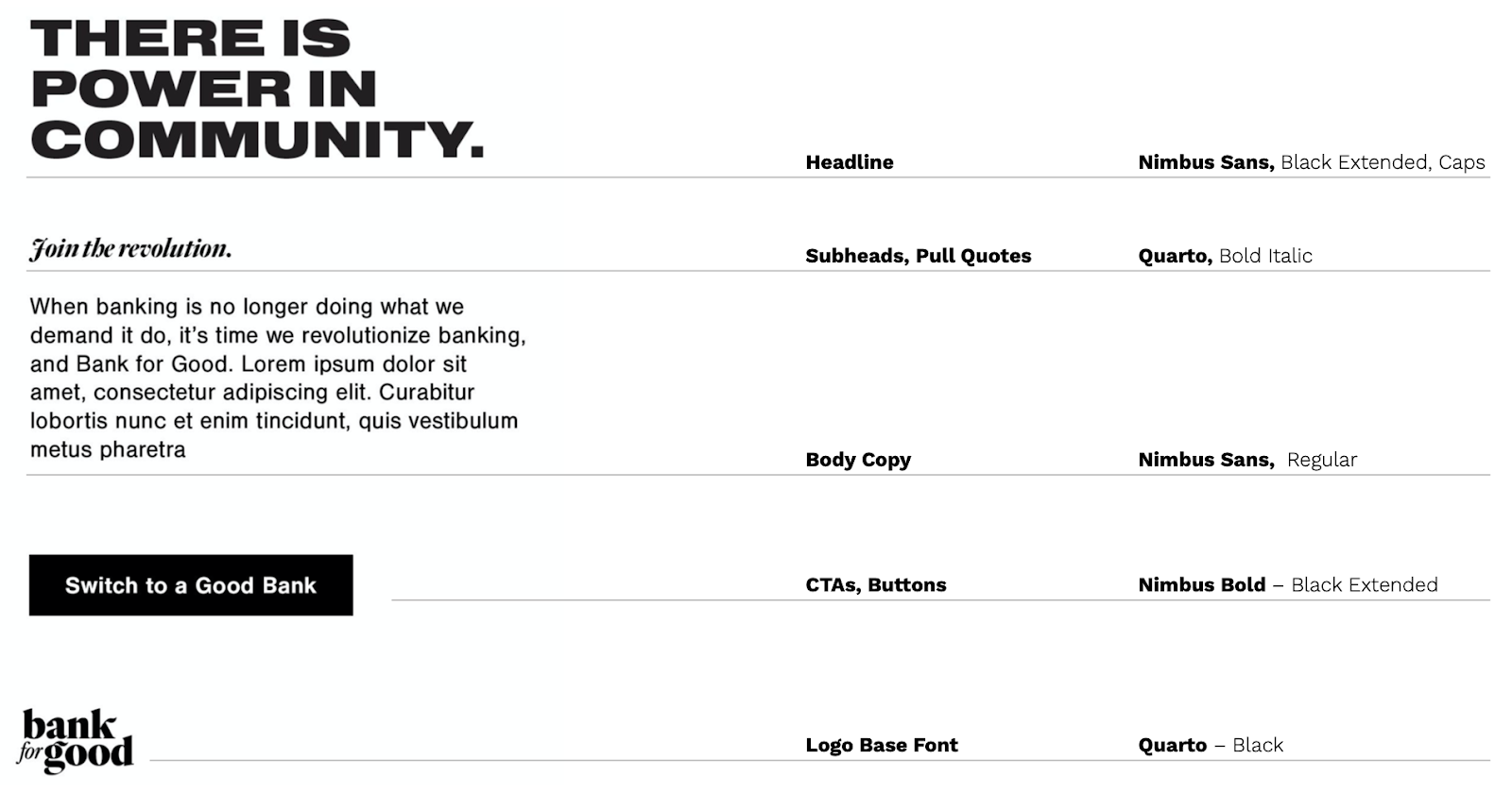
A bold aesthetic, and a flexible design system.
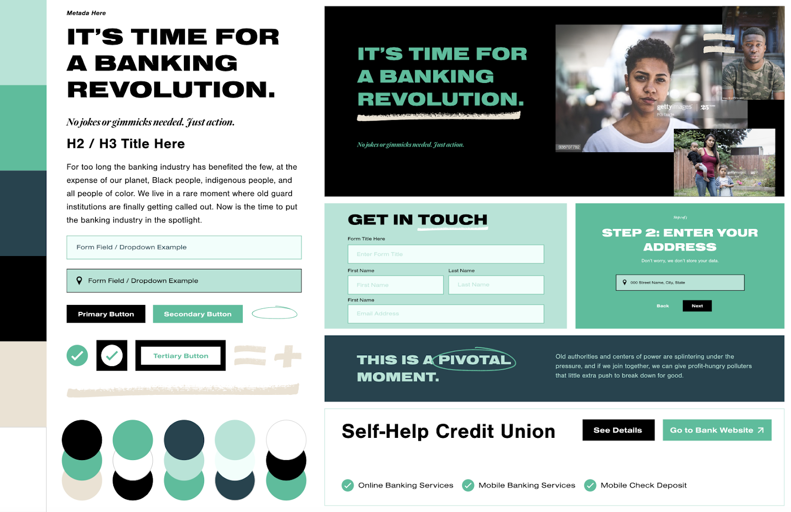
When it came to designing the online tool, we created two moodboards specifically focusing on elements like forms, button states, image treatments, and color pairings to hone in on the more detailed elements of the brand.
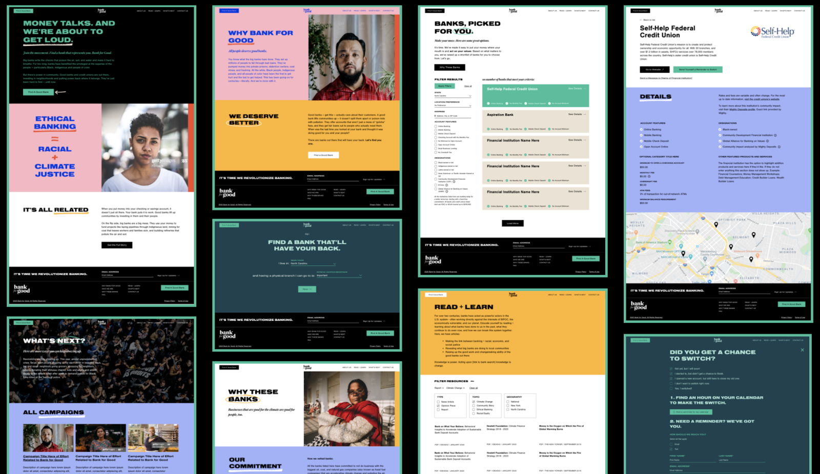
For the final website design, we incorporated the bold color palette by color blocking elements throughout. We used the hand-drawn circles and underlines to highlight meaningful calls to action. We drew on bold imagery that focused on one individual at a time -- someone who actively represents the movement.
