DEWALT.
DEWALT, one of the largest and most respected power tool manufacturers in the world, approached nclud to lead the user experience (UX) research and testing of a complete redesign of their primary website, dewalt.com. The project was backed by an extensive discovery process, with a focus on journey development and an emphasis on multi-platform design.

Strategy
Comprehensive research revealed insights needed for a successful redesign.
The DEWALT project was a comprehensive research-focused full redesign and redevelopment of DEWALT's consumer-facing website with an emphasis on brand positioning and product awareness. Early on in the project we identified two key challenges to focus our efforts on:
- Continuing the brand messaging of DEWALT being an innovator and leader in the power tools space, and not just the most expensive, but also the highest quality option for consumers.
- Although consumers knew they could find information online about tools, there was no ability to purchase them there. So, while the engagement did focus on eliciting an intent to buy, the underpinning goal was to recommend, cross-promote, and personalize product offerings.
Both visitors coming in directly from Google with a product or SKU search, as well as those using the website’s newly overhauled and built-in functionality, were put into a flow that didn’t just land them on the product they think they wanted: but the one that was best for their task or profession.
Through the conscious use of persona and scenario-based research, the information and visual design of every section on the website was meticulously intended to encourage this kind of passive exploration, while simultaneously accommodating for more task-based visitors.
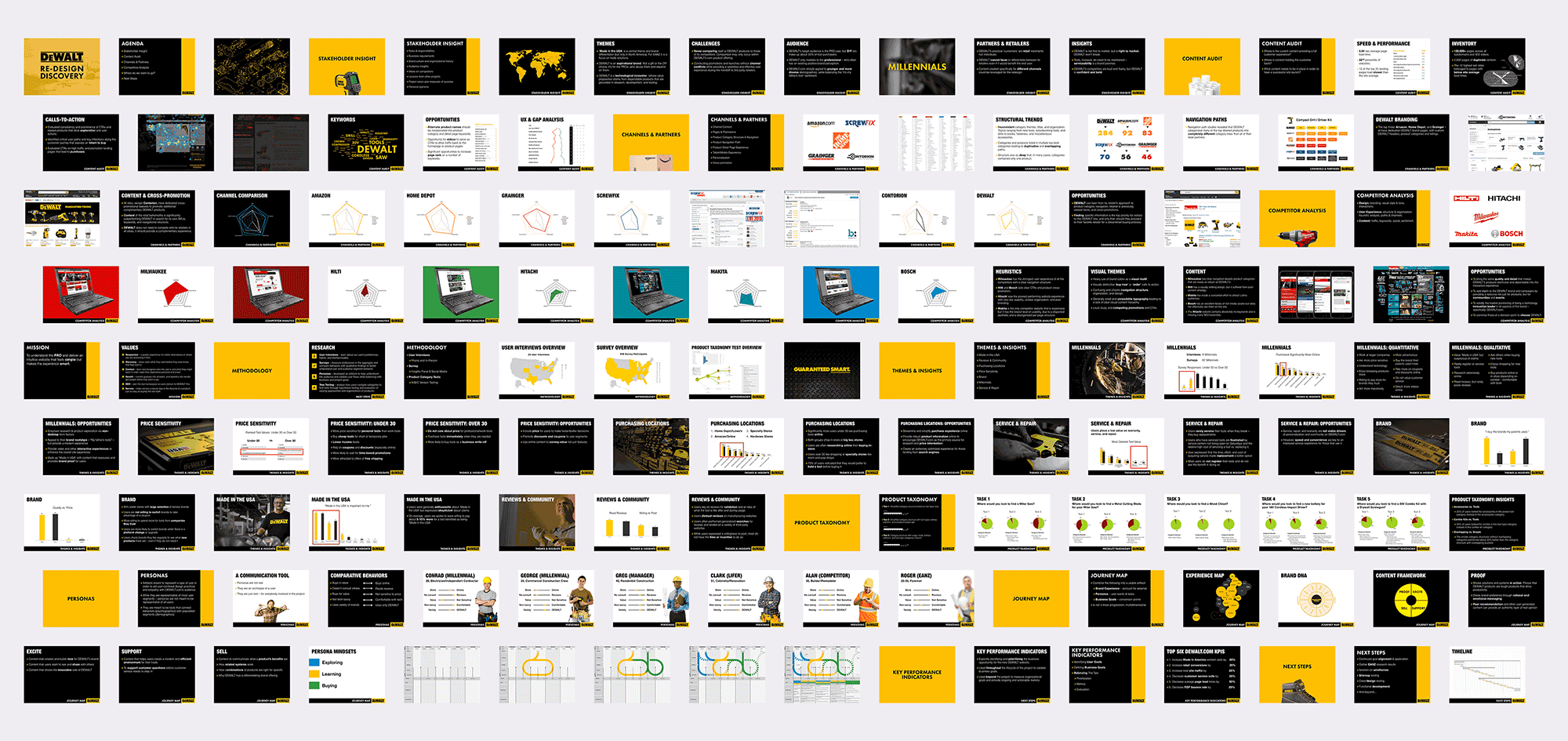
Our research process included:
- Stakeholder interviews of 26 DEWALT team members across six departments and three countries
- A website content audit of four different DEWALT properties and more than 2,000 DEWALT products
- Competitive and Retail Partner analysis of six competitor sites and eight tool retail sites
- User interviews 16 DEWALT tool users, along with more than 20 remote interviews with users in five countries
- User surveys of more than 15,000 DEWALT product and website users
Our research efforts culminated in a comprehensive findings and strategic recommendations document that was presented to key stakeholders within DEWALT. The findings informed the subsequent user experience phase of the project by serving as a constant guidepost to validate our approach as we worked with DEWALT to develop strategies and solutions for the new website.
User Experience
We used our research as the foundation to explore new ideas.
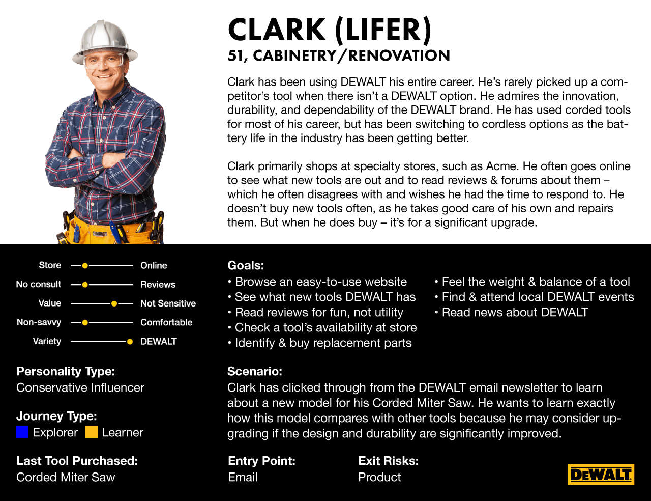
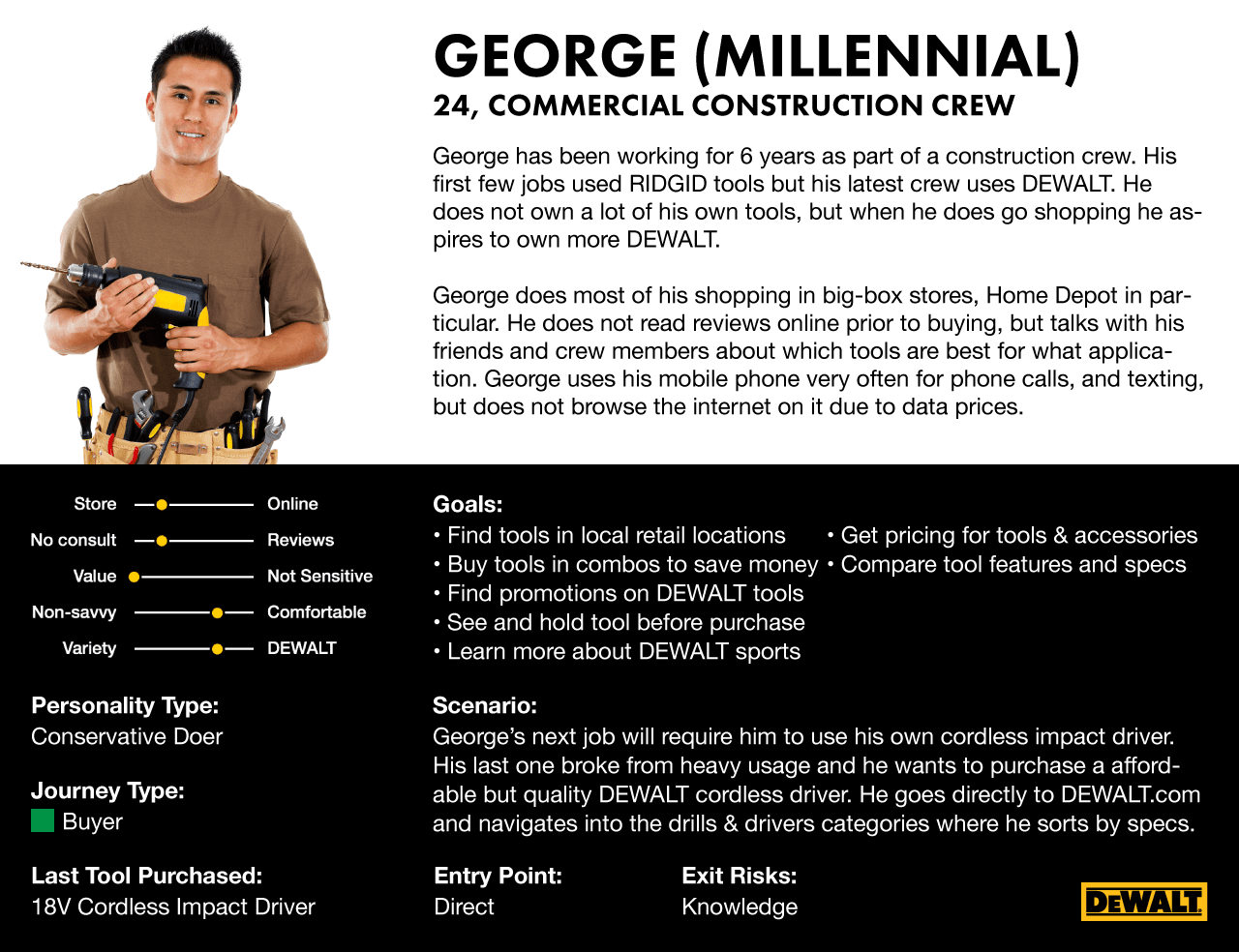
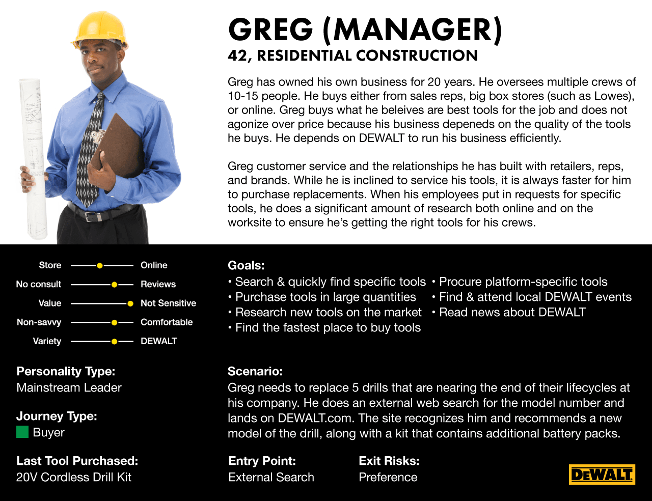
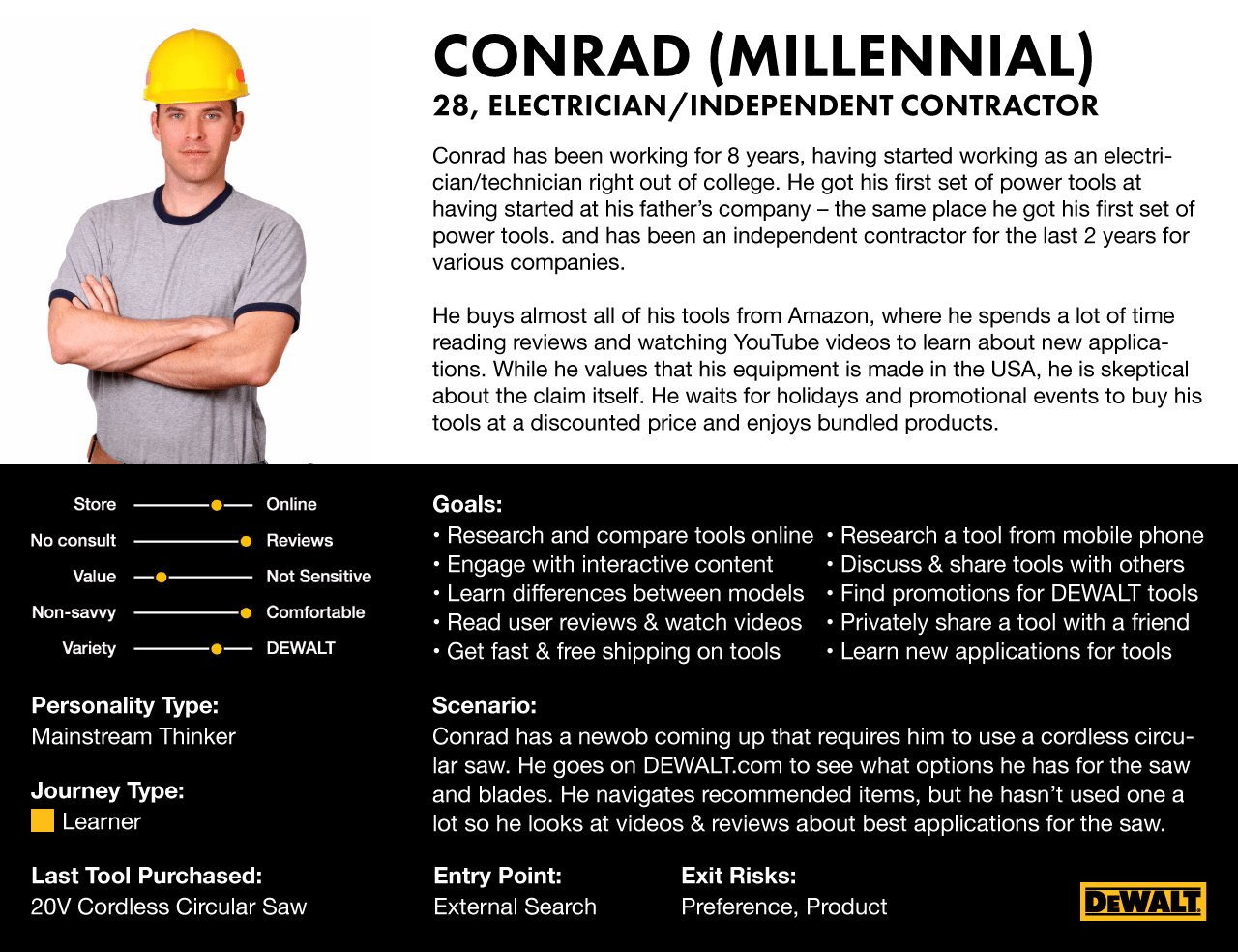
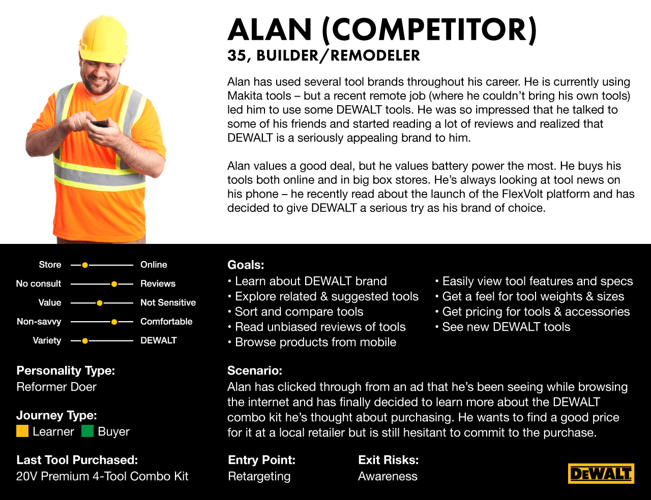
nclud used our research findings to create personas and developed user flows that mapped the experience of each user in accordance with his or her preferences. Through dozens of sketch sessions and brainstorms nclud iterated on various ideas and possibilities. The team divided the most interesting and promising ideas amongst the group, individually built low-fidelity prototypes, then returned to the group to critique and develop further.
Our user experience process included:
- Development of core personas to represent DEWALT's diverse international audience
- A KPI and Goals workshop with upper-level DEWALT staff to create metrics and goals for the project
- A UX Gap Analysis to measure and illustrate key opportunities for UX improvement on the website
- Three different Tree Tests with more than 1500 users, including A/B testing for various user patterns
- Three unique card sorting exercises conducted remotely with more than 2000 users
- Information Architecture recommendations to redesign DEWALT's product category structure of more than 2000 products
- Experience Mapping and User Journey Mapping for the core personas developed earlier in the process
- Sitemap development, including A/B testing across three variants with more than 700 users
- Wireframe & Design collaboration with both internal and external teams
- Live testing using mouse-tracking and eye-tracking technology
- Focus Group testing of design and UX prototypes, followed by recommendations and refinement
Results
Proof that a scientific approach can be applied to both the digital and business worlds.
The research, and subsequent research-backed user experience recommendations were compiled into a final deliverable that reinvented the online experience for DEWALT's customers. The resulting website has dramatically increased engagement and achieved or exceeded all project KPIs that were defined in the early stages of the engagement, showing that there can and should be a "method to the madness" when approaching a large-scale website overhaul project.
