DOOM.
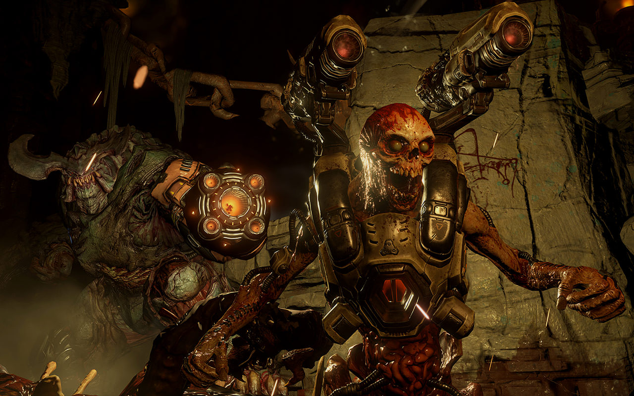
As one of the leading game developers and publishers for three decades, Bethesda Softworks has brought fans to worlds as diverse as the fantasy realms of The Elder Scrolls, the post-nuclear dystopias of Fallout, and the plague-ridden steampunk lands of Dishonored. One of Bethesda’s most well-known and influential properties is DOOM, initially released in 1993, selling more than ten million copies, and influencing hundreds (if not thousands) of games to follow with its futuristic sci-fi setting littered with demonic enemies, a nameless grunting space marine protagonist, and over the top mayhem.
With almost twelve years since the last DOOM release, Bethesda brought nclud into their team to help show off the new game and its features as well as to get fans champing at the bit to preorder and get their hands on it. As fans of the original game who remember frantically pounding IDDQD and IDKFA onto our keyboards to avoid another fiery death, we couldn’t wait to bring the demons and BFGs to a new generation of video game enthusiasts.
Strategy
The first step was to identify our goals.
Obviously we knew we were going to make something awesome and mind-blowing — but what did that mean? Our strategy started with a thorough competitive analysis of games currently or recently in their beta stage to determine their goals, how they presented information, and where they fell short so we could learn from their mistakes to make the DOOM experience better. We discovered that we should focus on three primary goals: generating buzz and excitement for DOOM, driving signups for both the beta download and game pre-orders, and encouraging community interactions with forums and social media.
Based on these larger goals, we developed key insights on how to achieve them. The first was a matter of content: the leading competitive beta sites and landing pages all featured more content than the entire DOOM website. We needed to tease and feature more information and imagery from the game and beta right off the bat to get visitors interested and involved in the experience, encouraging them to share with their friends and followers. The second goal revolved around calls to action: other sites had prominent and visible pre-order and sign up calls to action featured in related content sections, while the DOOM site had a simple and hard-to-see button placed in the sticky header. Our solution was to redesign every call to action from the ground up, bringing in the bright reds of DOOM to create a larger eye-catching design that not only lived inside the header area, but was also incorporated throughout the site. The final insight was about community: the DOOM fanbase is huge and thriving across a plethora of platforms, but there were few links to explore it and almost no engagement from the official site. Starting by simply embedding social media feeds and the latest news, we made sure to add well-designed links to all of the active social media platforms as well as the official forums to increase the conversation and buzz around the game.
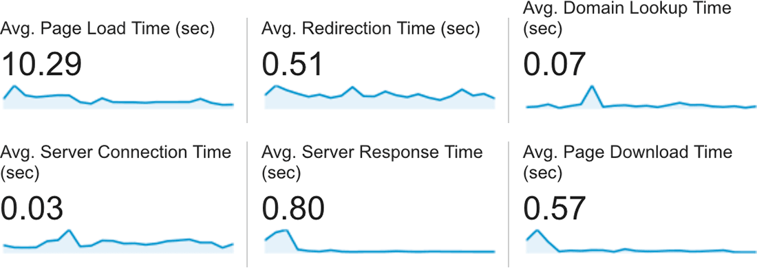
We didn’t stop at seeing what the competition was doing — we needed to know what the current site was doing wrong in order to improve. Diving deep into long-term analytics and search rankings and results, several huge issues immediately rose to the surface. There were few internal links and calls to action for visitors to explore more content on the site, leading many visitors to leave almost immediately upon landing. Even if a visitor did successfully sign up or preorder, the abnormally high overall bounce rate drove down SEO and led to lower than ideal search rankings for preferred keywords. Further analyzing search results only reinforced the issues with search rankings. Many online outlets with large user bases and high domain authority were consistently ranked above anything on DOOM.com itself, despite that information being originally sourced from the site (and related posts on Bethesda.net, the official Bethesda blog). The problem was twofold: the existing technical solution for the “age gate” was blocking content from being indexed properly by search, and the lack of content integration into the DOOM site meant there was no SEO boost from external links. Finally, more than fifty percent of visitors were using mobile or tablet devices, but page load time for them was over six times longer than Google’s recommendations, greatly affecting overall rankings. All of these issues became integral to the decisions we made in the design and development process moving forward.
User Experience
Before starting a single sketch, we made sure to understand the user experience front to back.
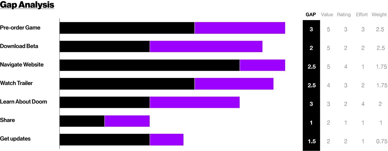
We started with a comprehensive UX analysis of the existing DOOM site (as well as competing game sites) to quantify the state of navigation, information architecture, accessibility, and usability. This included heuristic, aesthetic, pattern, and gap analyses to detect problems and errors that would overly confuse visitors or prevent them from achieving their goals. After diving into every nook and cranny of the site, we made a wide variety of recommendations to the Bethesda team to correct and improve in order to provide the best experience for everyone. The biggest of these was simplifying the flow into the beta content — instead of making visitors jump through hoops to understand how to get the game, start from the very beginning with a simplified flow and large promotional call to action across the site taking them to a beta page containing all of the details and information they would need.
At the same time, we needed to understand the entire design, branding, and visual language used for DOOM in order to create something truly memorable. We pored over everything from brand guides to the current site design to promotional presentations and gameplay videos to get a big picture view of how the game was represented. Our team quickly found that the design and branding found on the DOOM site didn’t match up with what fans should expect — presenting a “traditional futuristic sci-fi” feeling with crisp lines and bright interface elements versus the dark, ominous, and in-your-face style found in the actual game. To solve for this, we looked to tell a more cohesive story through the use of moodboards and a concept book exploring four primary aesthetic themes: rock & roll, technohorror, disturbed, and death. Each theme is presented with a collection of in-game imagery, interface elements, and associated textures to visually represent the different aspects and unique experience of DOOM.


Design
We knew that we needed to capture the chaos of DOOM.
As always, we jumped into rough sketches on paper, group brainstorming sessions with the entire project team, and lots and lots of whiteboard drawings and discussions. From there we started fleshing out more advanced design concepts and interactions, from the high level to trying to solve for specific design issues and concerns. Using the moodboards and concept book as reference, we avoided cliché sci-fi design elements in favor of blood splatters, big guns, and in-your-face demons. At the same time, we wanted to bring in more elements of the “DOOM brand” — dark reds, hints of brighter oranges, stronger type, and dust and decay were all introduced as we progressed.
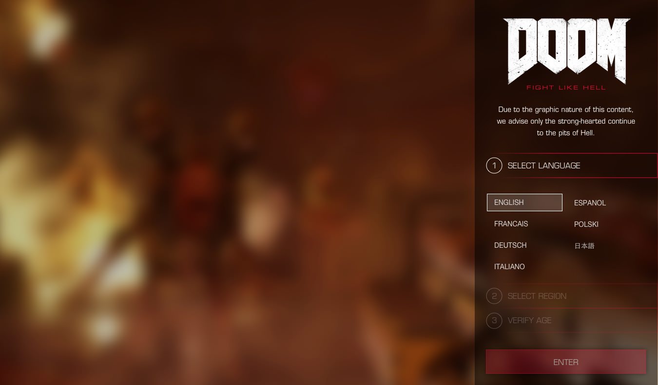
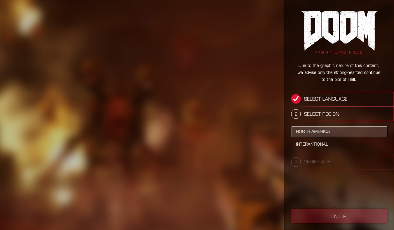
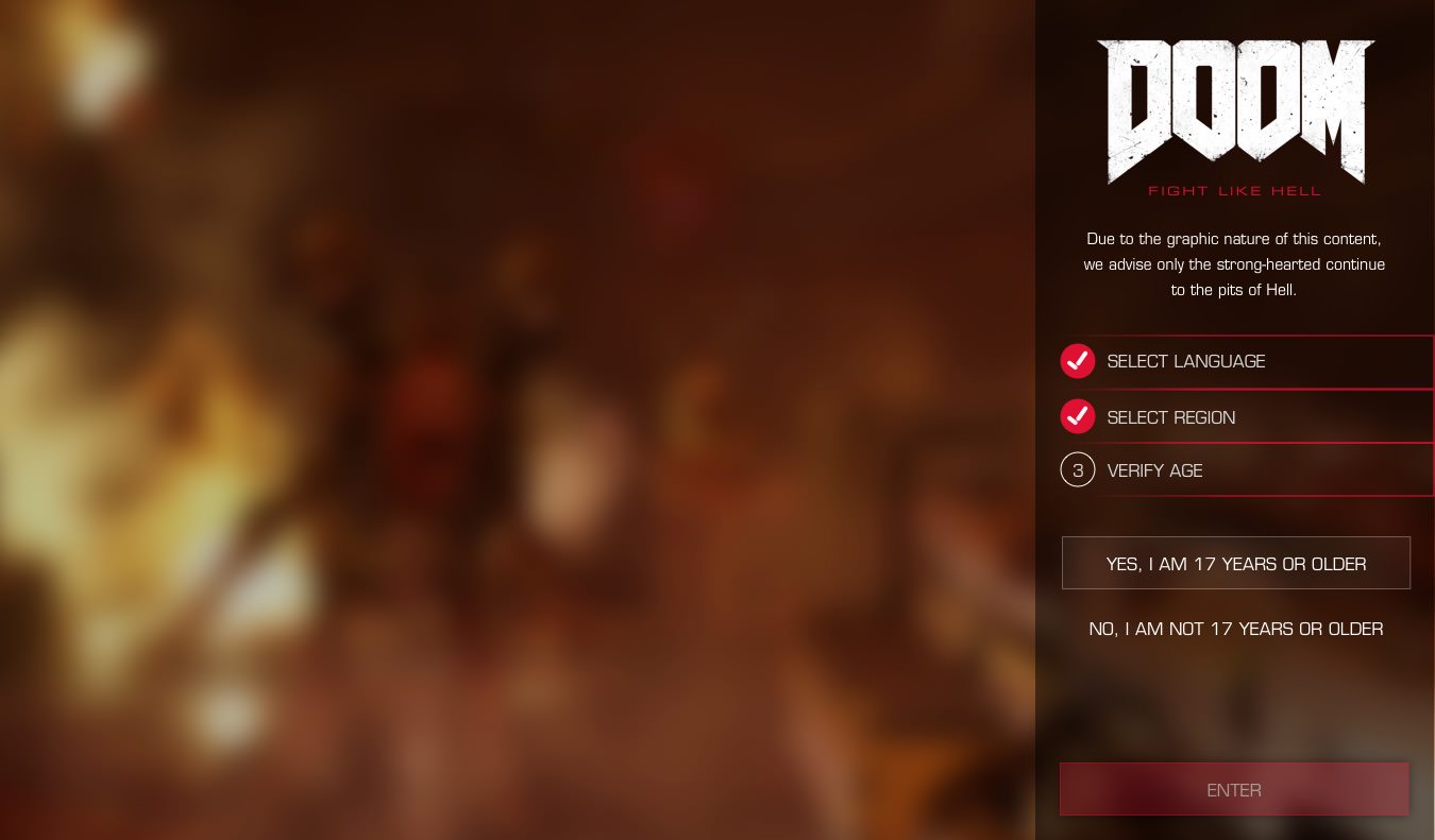
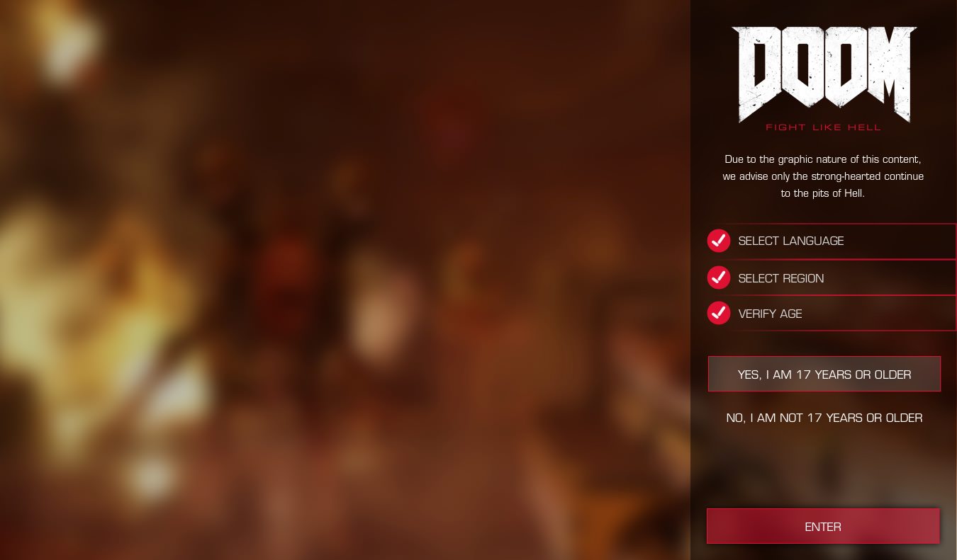
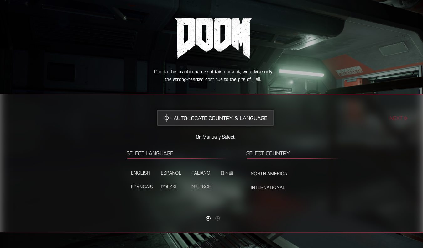
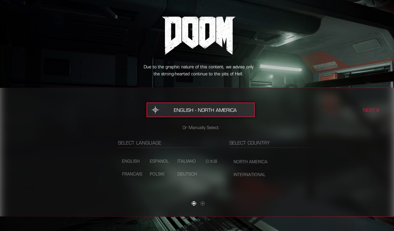
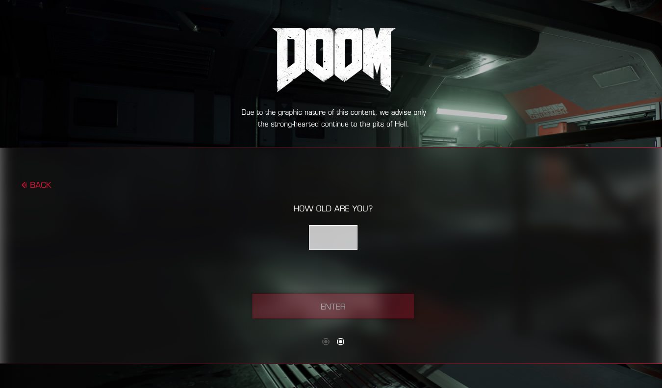
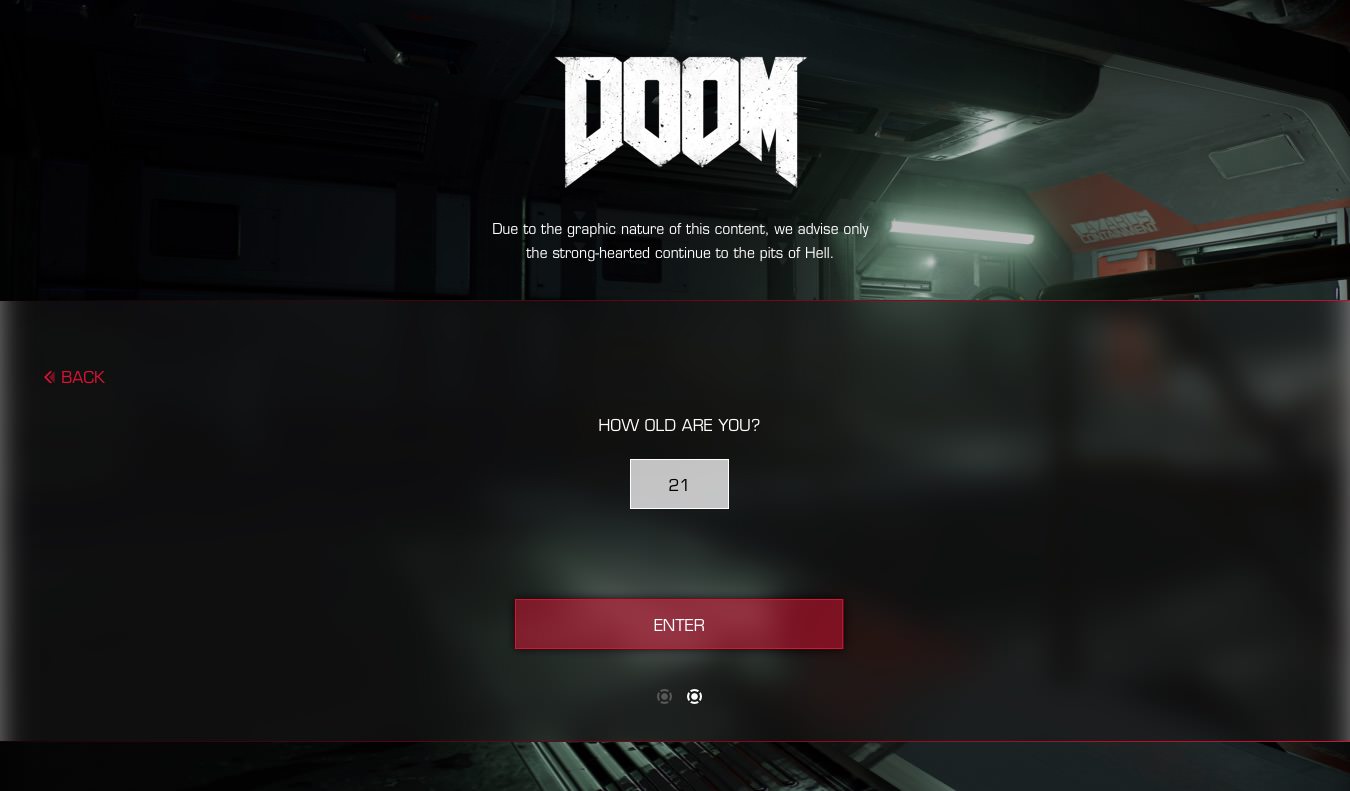
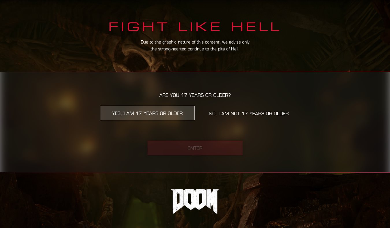
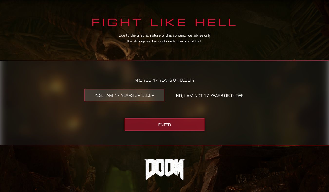
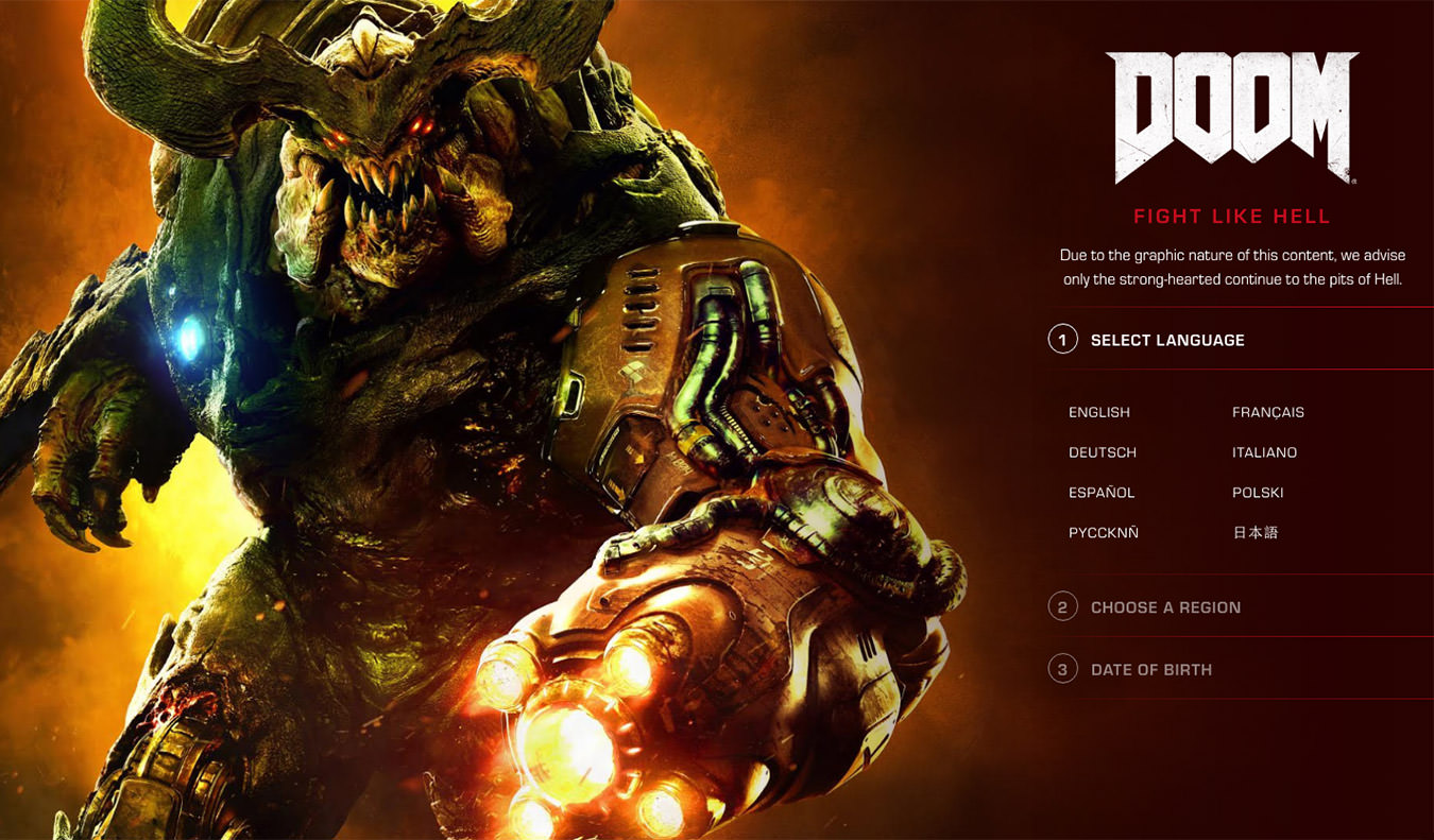
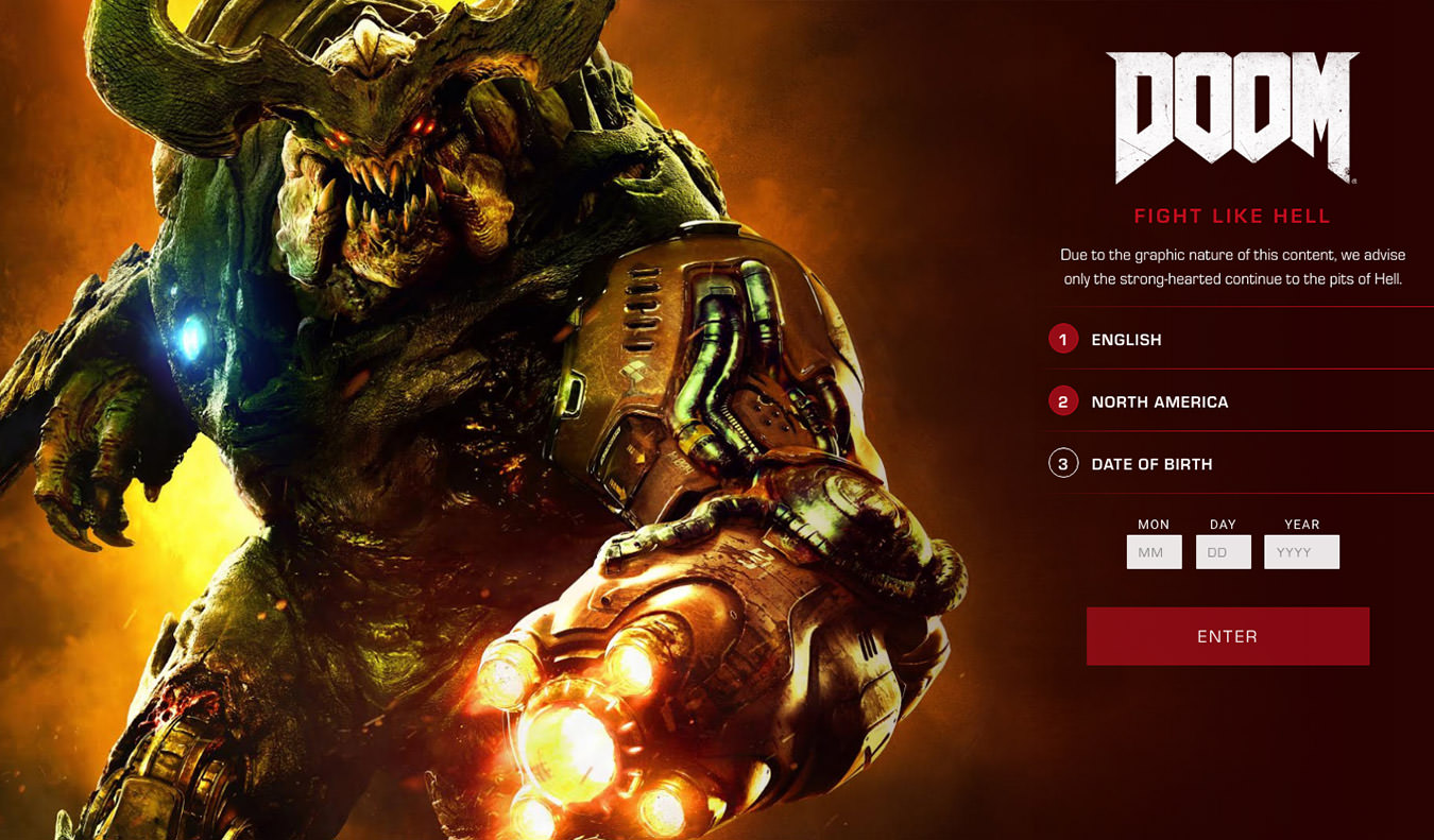
The first major goal of the project was to tackle redesigning and rebuilding the existing “age gate” across the site. As a game publisher, the Entertainment Software Rating Board (ESRB) mandates that all content rated Mature must not be visible to children under 18 (including videos and screenshots), so a site-wide age and location confirmation is the best and most widely-used method. The existing gate was a tedious experience at best, taking over fifteen seconds for a desktop visitor and almost impossible to use on mobile devices. In order to streamline, we approached it from three angles: one that auto-detected location and language, one that simply prompted age with a yes/no button, and one that moved all prompts onto a single well organized screen. The final approach ended up being the winner, so we tested various layouts and organizations until we were able to streamline the entry process into under six seconds across all platforms. Our initial design concept was to blur the design of the main site to serve as the background, which would come into focus as the age gate was completed. While testing, we found that this scaled poorly across the various sections of the site, performed poorly on underpowered devices, and was confusing to visitors. We replaced this with a large, vivid image of a demon surrounded by flames that zoomed into the site once users successfully passed the age gate, reinforcing the DOOM brand and creating a compelling interaction.

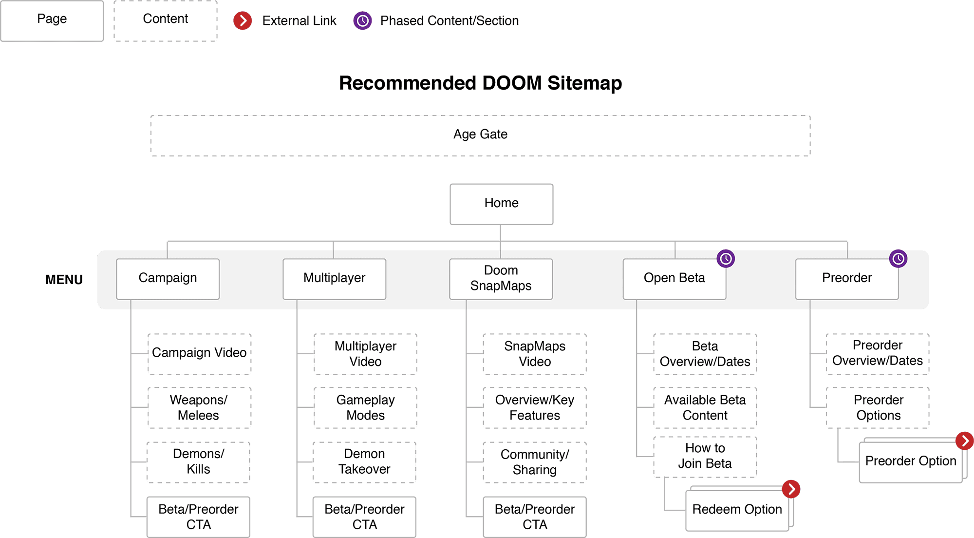
Alongside the age gate, we were focused on bringing new life to the entire DOOM online experience. Instead of simply slapping a new coat of paint on it, we thought outside the box to design various concepts, elements, and interactions that could be integrated in new ways. The simplest and most practical of these was taking the existing design and implementing a more modular structure that could grow and evolve with the site. It brought news, media, and promotional blocks front and center onto the landing page, allowing for visitors to easily get the most up to date information as well as find out what is coming in the future for DOOM. In conjunction with this, we designed interactive modules for subpages so visitors could explore the weapons and demons of the game with huge high resolution screenshots and videos. These modules also allowed for teasing new in-game elements (useful for an ever-expanding game world). A high level concept started by stepping back from the existing property, rethinking it entirely: what if the landing page told a story instead of just marketing or promotions? Starting with a foreboding corridor at the top, more and more pieces fell into place as the visitor moved down the page to create a sense of unease before unleashing the full cadre of demons and hellspawn. Laid out as a simple brochure-style page, it avoided heavy interactions in favor of gameplay videos and high-resolution imagery. Diving down into the details, we also created concepts for specific interactions: more prominent call to action designs and hover states, logo animations filled with interference, and demonic page transitions.

All of these designs, concepts, and approaches came together as we began the design process for the final beta landing page. With an upcoming open multiplayer beta and a huge marketing campaign behind it, the page needed to reflect the spirit of DOOM as well as drive visitors to actually want to play it. Incorporating elements from each of the concepts, a brochure-style page was designed that played off the ominous feel of the high-level concept while using the modular structure of the practical idea. As opposed to telling a direct story, the goal was to bring in multiplayer imagery and video that would show off what fans could expect to see in the actual beta gameplay, including weapons, games modes, demons, and levels. Modules for questions, news articles, and social media updates were included to keep visitors up to date. A particular focus was on being able to share the page directly to social media (via Twitter, Facebook, or email) and creating a “pre-order” module that drove visitors to the game’s pre-order information page — the goal to get as many people playing the beta as possible so they were excited enough to purchase the full game.
Development
Development was an integral part of the process from day one.
We weren’t just here to build a pretty site — we also needed to rethink everything about the DOOM online experience from a technical standpoint to ensure it measured up to the highest standards. As our strategy research had shown, there were major hurdles in place for success, and compounding that was integrating any solutions into an existing and unfamiliar codebase. We immediately hit the ground running — getting up to speed on the processes the Bethesda development team was using, working hand in hand with design to create innovative interactions, and examining and analyzing the current code to find new ways to optimize and enhance the overall experience. We quickly set up our own internal build process, implementing Assemble together with Gulp to develop and compile SASS, JavaScript, and Handlebars templates. As we started to explore complex animations and interactions, GreenSock Animation Platform (GSAP) became an integral piece to develop performant UI animations across platforms and devices. As each component was finalized, we relied on BrowserStack testing to ensure browser compatibility and speed.
The age gate was the first technical challenge. As initial research found, the existing gate was blocking search from indexing the site’s content. We performed site audits of competing game sites to fully understand their implementations and how they solved for this issue. The current DOOM age gate was being rendered by redirecting visitors to an actual age gate page versus simply blocking content on the page. Not only did this cause the crawling and indexing problems, it also led to the incredibly slow page loads. We threw the existing method out the window, instead developing a leaner solution that used JavaScript to load the age gate via AJAX, allowing web crawlers to properly index the content as well as speeding up page loads exponentially. But we didn’t stop with simply making it technically functional — with such a good-looking design, why stop there? We created an immersive interaction for the age gate upon completion, making visitors feel like they were moving directly into the DOOM experience.
As design moved into fully fleshing out the beta page, development was right there alongside them, reviewing the existing DOOM codebase and structure to figure out the best ways to incorporate new code and styles. Using SASS, we developed a new CSS structure specifically for the beta page that was namespaced accordingly in order to prevent specificity clashes with the existing styles. As the new page was built around more modular content, we put a system in place that allowed developers and content managers to easily and quickly move around or replace modules. Working with strategy and user experience experts across teams, we implemented tools such as Google Tag Manager, Google Analytics, and Mouseflow to gain a more complete understanding of how visitors were using and interacting with content. These tools allowed us to quickly adjust and update as necessary to meet and exceed our goals. With so many visitors coming from mobile devices, we used image source sets with responsive images to reduce the loading size and ensure that everyone had the best possible experience.
Through both the age gate and beta page development, there was one constant hurdle that required continual attention: localization. DOOM is a worldwide phenomenon with visitors and players from around the world. As we handed off each piece to the Bethesda development team for implementation, they were busy working with their content team to translate every word into eight languages before launch. While languages using western characters are easy to implement, we had to take into account the differences in type and layout with characters in Cyrillic and Japanese, as well as the differing access to social media and networks within other countries. Taking these requirements to heart, we made it as easy as possible for the Bethesda team to implement localization with rules and classes built into the CSS structure to change language display and show different social networks. This collaboration created a beta page that not only adhered to industry standards and best practices for development, but also created an engaging and inviting experience for fans around the globe.
Results
The project was an explosive success.
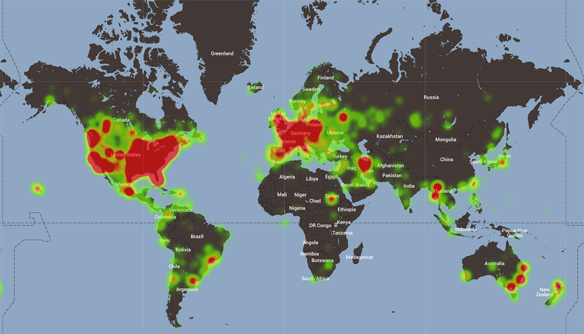
With a huge social media and commercial push leading up to the open beta, there was a palpable buzz and excitement around DOOM. The beta landing page alone saw almost two million visitors in the three weeks between launch and the beginning of the beta period with an average of over a minute spent on the page per visitor. It drove nearly twice the amount of traffic to the preorder page (via preorder calls to action) compared to the home page — with over seventy-five percent of game preorders during this period originating on the beta landing and almost twenty percent of overall game preorders happening during this period. Nearly a quarter of a million visitors engaged with the Steam beta download button alone. The multiplayer beta trailer was watched by over twenty-two thousand people, accounting for nearly a third of all video views since the beta announcement and page launch. With the changes to the technical backend and to the age gate, crawlers were able to index the site’s content and the query “DOOM beta” had an organic click through rate of over twenty percent (with visitors often trusting the official site over other outlets). Our localization implementation was incredibly important to the success of the beta launch, with the German language version and a Russian social network in the top five referrals for visitors.
In addition to blowing by and blowing up all of initial project goals, the concepts and ideas that were created during our collaboration were spread throughout Bethesda to influence future projects. Other game brand managers participated in our strategy sessions and presentations, eager to learn more about the process, designs, and findings so they could apply them to their own projects. A new game, a new terrifying horde of demons, a new arsenal of overpowered weapons, and a new online experience — DOOM is back in a big way and game fans around the world couldn’t be more excited.
About Bethesda Softworks
Bethesda Softworks is an award-winning publisher of premier interactive entertainment software, including such blockbuster franchises as DOOM, QUAKE, The Elder Scrolls, Fallout, Wolfenstein, and Dishonored. It has been one of the leading worldwide game developers and publishers since 1986, when it was founded in Bethesda, Maryland.