CEB.

CEB Global is a consulting firm known for world-class best practice insights which are used by thought leaders and executives from Fortune 500 companies. When it came time to apply some best practices to their internal member their web platform refresh, CEB turned to nclud.
Strategy
Research, Research, Research.
To design for a research-focused brand means to apply an extra-critical lens to the discovery process. While focusing on the key tenets of CEB’s needs, we noticed a knowledge gap between departments company-wide, due to the CEB’s rapid growth and acquisition of multiple properties over the years. We found that their existing editorial workflow did not match the needs of the internal content creators or the audience. Some pieces of content were created as marketing initiatives, while others were intended for regular consumption by devoted members, and the systems that were currently in place prevented cohesion between the two goals, internal teams, and layouts.
With the problem identified, the team turned its sites on the target user-base. During a journey map workshop, the team uncovered a pivotal revelation that would inform the entire solution: of devising two separate systems for free and premium content, the team needed to build a seamless experience that worked for both members and non-members. The system would need to marry the pieces of the existing member site with the to-be-overhauled public site, yet would need to provide enough versatility to achieve the public site’s goal of expanding the brand’s visibility. After realizing that a traditional wireframe approach would not provide the proper context for a modular system, the team began work on building a framework that accounted for thousands of pages and dozens of different content types.


User Experience
The Architecture Puzzle.
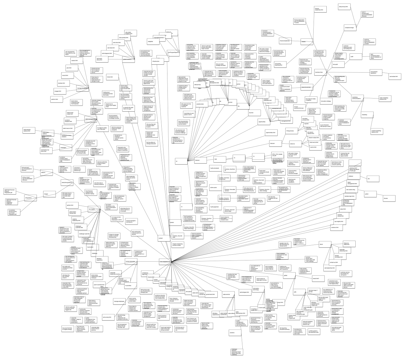
Framing the information architecture came with the unique challenge of creating structural cohesion according to previously mentioned user journeys, while still using CEB’s multiple existing architecture systems. The public site maintenance and ownership was a separate entity from the member portal site, which had its own team of experience designers and strategists, and existing documentation for the full site experience was limited. To bridge the gap between the two entities, the team leveraged the existing IA from the member site with content audit findings for the public site.
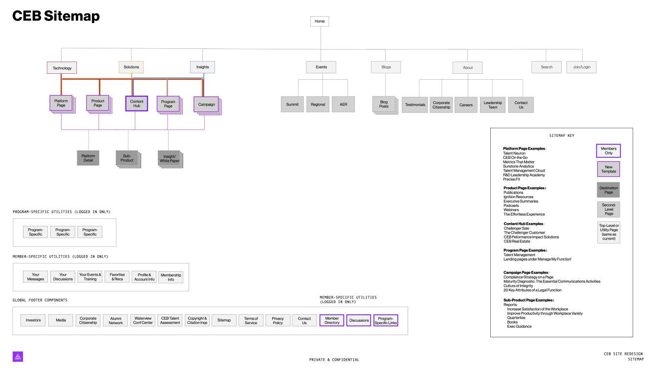
The decision to preserve the structural work in place from the internal design teams allowed the nclud team to focus on unifying CEB’s public and member content by utility, rather than subject and audience. Instead of creating standard sitemaps that structure the loose page layouts in each page stack, the team created a Site Flow, which was later dubbed the “Metro Map.”
The team structured the map frame in traditional sitemap format, with the homepage at the top level and all subpages cascading in their appropriate positions, but instead of focusing on individual pages, the team categorized content by type, and brought in the use of color to strategically indicate the conventional and unconventional paths by which users could flow through the site as they uncover new information on the member side. This process allowed the team to more precisely create a sitemap by content utility, rather than specific content, and it allowed a deeper understanding of how users need to get around. The “Metro Map” had the added benefit of highlighting which content blocks could be templated and scaled modularly.
From there, users were routed through main “content hub” levels, to allow them the simplicity of consuming tailored content on one page. The idea of bucketing content by type was pretty drastically new and scary for all the content producers on the CEB team because of the implications on workflow and strategy on each side of the company, but once the team understood the flexibility that the proposed methodology would provide each production team, buy-in was swift and complete.


Design
Un-thinking design.
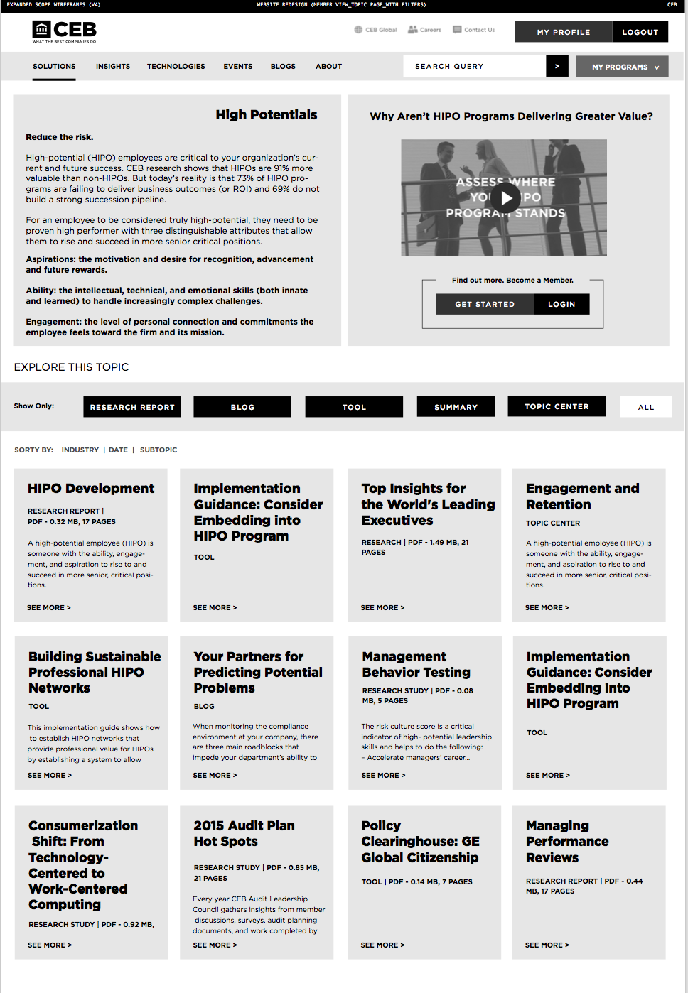
CEB is the expert in management insights, across all disciplines and industries, so its content for members needs to be varied in length, style, and brand; its public site content, however, is geared toward prospective members. In all cases, users needed to be able to quickly consume and browse through all relevant content, both passively and actively, when they need it. Using this premise as a guiding principle, the team created layouts on a 12-column grid that could account for columns, rows, and modules by content type, to maximize flexibility.
With layouts decided the team began the process of scaling the experience modularly, picking the most successful modules for each content type and dropping them into real content examples throughout the site. From there, the team fleshed out alternative use cases for each module on each page. By working modularly, the team provided the most versatile solution for CEB and their users, and also saved time in the development and design phases by cascading the rules around each module type through the project phases.
When it came time for visual design, nclud focused on creating cohesion across the templates by applying aesthetics in-browser, with each individual module stacked vertically on one long Module Library page, which served as the master reference file for module styles. The Team designed with SASS, for its flexibility, modularity, and ease of integration into CEB’s existing CMS. While working through the in-browser design process, the team recognized the need for a thorough, effective communication of the training around the new production process, so that CEB could rest easily knowing that their production needs would be foolproof. To preserve the integrity of the wireframes and page structures, nclud created a Module Guide, which outlined the use cases for each module and its rules for use on specific pages. This two-pronged approach in providing deliverables to CEB ensured that the design solution could be used efficiently and transparently across all internal teams.
