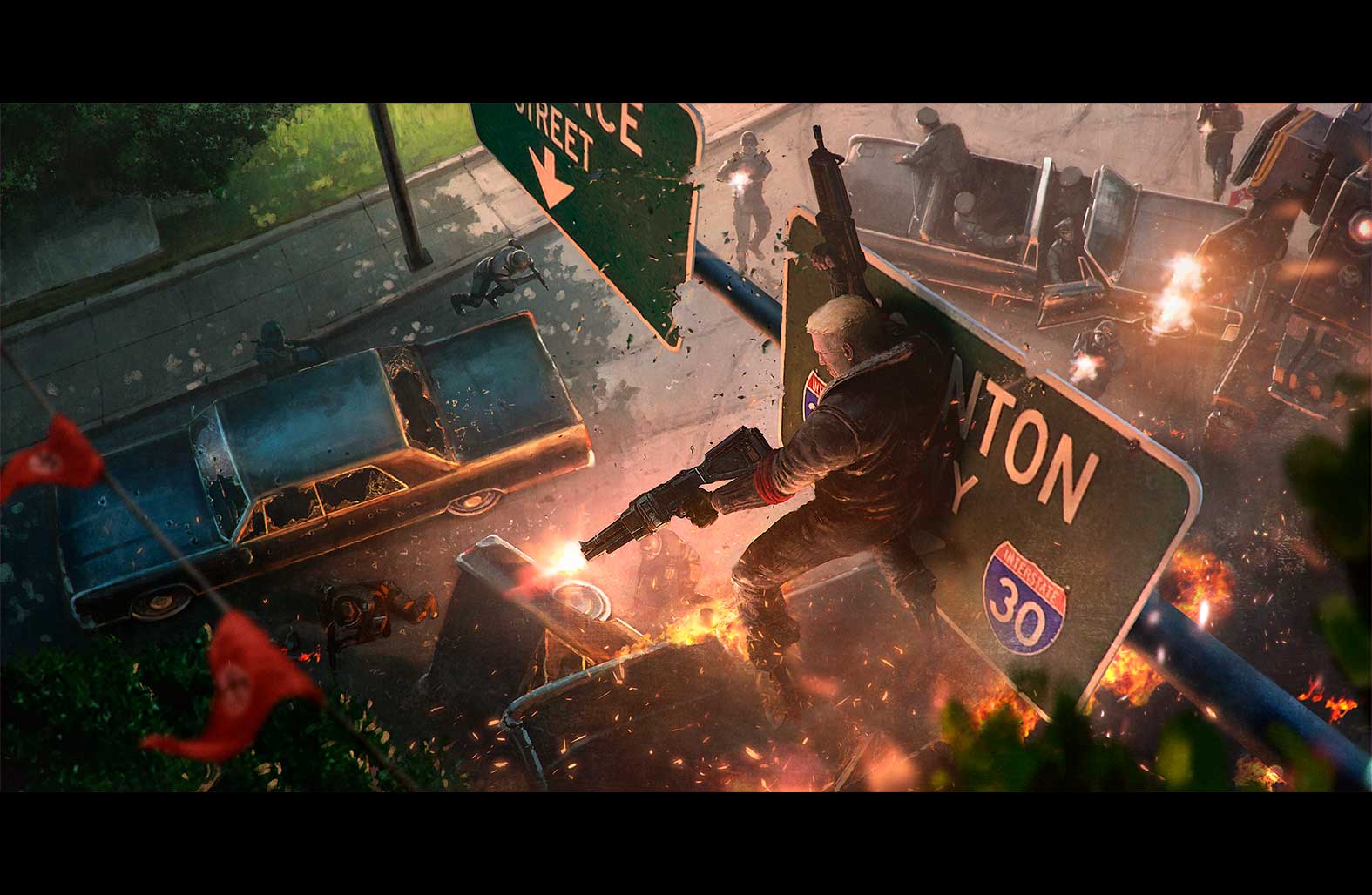
Wolfenstein II: The New Colossus

For decades, Wolfenstein has constantly reinvented itself and pushed what inventive first-person gameplay and narrative is all about. For 2017, The New Colossus continued this legacy and needed to build on the excitement generated by the announcement while encouraging email signups and pre-orders. nclud, having already worked with previous franchises such as DOOM, partnered again with Bethesda to create a phased, immersive experience that worked across the globe.
Strategy
Reaching all demographics.
Understanding the marketing cycle for the game was key to developing our approach. We developed a phased approach to the website roll out for the pre-order, launch and post launch phases each with their own look, content, and desired conversion path. Additionally, the client wanted a multi-funnel conversion approach. We took client research and blended it with our own discovery process to develop the ideal segmentation for current and potential fans of the game.
With the UX team’s research on user segmentation, the interactive team thought of concepts that satisfied core demographics. For users hungry for narrative-heavy content, Wolf’s online experience could be a “Wilkkomen to Amerika” travel brochure with German tourists traveling from New York to New Orleans. Another direction was “New Germericana Times,” a storytelling newspaper that promoted “The Great Countdown” and revisionist entertainment of 1960s era. Other user demographics, such as the gameplay-oriented user or sci-fi aficionados, would be driven to tailored content for a specific genre of the latest weaponry expose or Mars landing videos that would appeal to their unique tastes.
Initial Concepts by multiple team members let us explore idea quickly and cost effectively before deciding on a campaign theme. From the start “The Germericana times” theme Resonated with the Team.


Initially the Team explored the Dichotomy of the nazis and the resistance a well as The concept of Germericana Culture.


Design
A multi-phased approach.
For the homepage, the design team designed a fluid, customizable grid system that served the marketing team pushing out latest news updates, videos, multimedia galleries, and promotions for Wolfenstein II leading up to launch day. Subtle but critical details such as TV screen static on a hover state, smooth animations on the hero image, and dynamic visual presentation evoked the tone of the game in a slightly perturbing manner. More importantly, the CMS and front-end was developed to work seamlessly across different smartphone, tablet, and desktop sites using multiple language outputs and unique content needs. It was also essential that the team follow Wolfenstein’s brand guidelines, ensuring to exercise production amidst rigid parameters but using creative control when documentation hadn’t covered the unique challenges of web design.

The team thought about the entire marketing of the game from trailers to commercials and other advertising and developed a content strategy that evolved with the promotional strategy.
The modular grid system was created to give flexibility to Bethesda. Allowing them to mix and match content during all phases of the promotion of the site.


To aid in the immersive experience the team created a germericana music streaming service based on tracks made for the game. All landing pages funneled to the pre-orders page.

Development
For your eyes only.
Development provided two unique challenges: first how to ensure sensitive content was not shown in areas where it was outlawed and how to show metadata behind the ESRB-mandated age gate.
For the localization we worked closely with Bethesda’s technical team inside of their custom CMS to create separate locale buckets for content/assets which were used based on language selected. Additionally, the platform also checks geolocation, so users located in Austria/Germany were automatically redirected to the DE language and thus the sanitized assets.
For the age gate we used a PHP-based user-agent sniffer to determine if the site was being visited by an actual human or a search engine crawler, once we determined the site was being crawled by a non-human bot, we served an age gate-less version of the site so meta data could be read and indexed. If the user was human, they were served the age gate to complete before moving forward.
Results
Achievement unlocked.
Nearly 1/3 of all users who came to the site completed an “order intent” conversion - such as a link off site to Steam, Xbox.com or PlayStation Store for digital downloads or one of the many partnered retailers throughout the globe. 71% of those conversions were order intents coming before launch - a major KPI for Bethesda.

33%
of all users completed an order intent conversion
71%
of all goal conversions happened during the lead-up to the Game launch.
1,000,000+
total goal completions from announcement to launch.
